Mobile-responsive Email Marketing: What You Need To Know
by Publicators

August 10, 2015
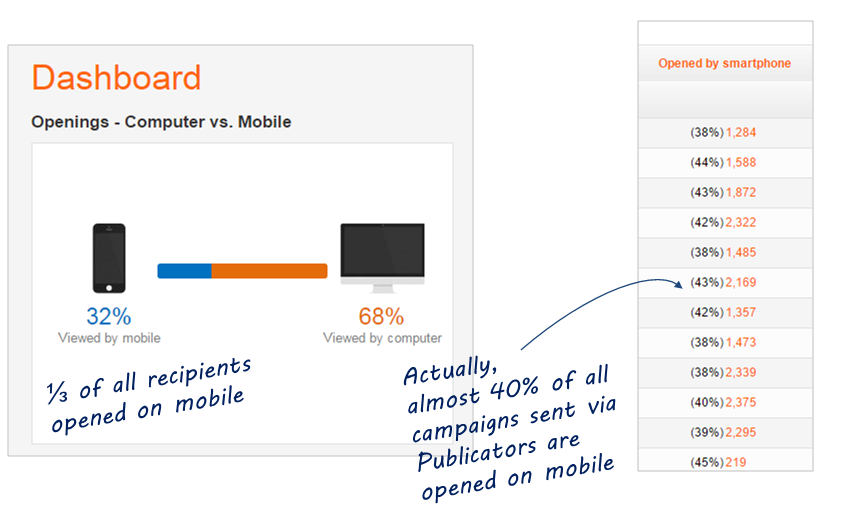
All experts predicted that in 2015 a further shift to mobile will happen. Here is a sample of our system reports from June 2015:
Over 40% of emails sent via Publicators get opened on mobile.
.png)
How many of the newsletters and marketing emails you get provide you a class A reading experience?
Here are some tips for maximum campaign optimization for mobile phones,
You can use it as a checklist before rolling out your next email campaign
Single Column is a much better choice of layout for content on small screens. The upper left-hand corner of the email might be the only area displayed (before swiping and zooming), so make sure it serves the message well.
Images: many email apps automatically block images’ loading. The best thing you can do about it, is use more text and less images. Also, do make good use of ALT Text. Either write enticing copy for it, or add CSS styling code to create a typographic effect. If you need help with this coding tweaks, contact me via email or phone.
Copy: Subject Line and Preheader texts need to be super short and clear. The Preheader was “traditionally” used for a link to open in browser, or affirmation of subscription - but to get people to open your email, it’s best to use this precious space for persuasive content.
Use large fonts: 14px for body text, and at least 22 pixels for headlines. iPhones will automatically resize any font under 13 pixels - you can take this as a design recommendation.
Call To Action Buttons: These should be big, too - Apple design guidelines recommend 44 X 44 pixels.
If you want to learn more about responsive email design, we recommend this wise article from A List Apart design magazine, or contact us to specifically adjust and tweak your HTML.
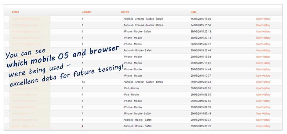
Testing: Mobile phones vary so much in size and operation systems - there’s Window’s Phone on top of Android and iOS, and many people use downloaded email apps, like Yahoo’s.
Also, some people go over their emails while commuting or lounging, on tablets, such as iPads and Kindle Fire.
You probably can't test your campaigns on dozens of devices, but do keep a little checklist of at least three mobile platforms, on which you’ll test all your emails before sending.

People look at their phone 100-150 times a day, so mobile-responsive email design is necessary to keep meeting marketing goals. At Publicators we've got you covered - your email campaign designs will work and look great also on mobile phones and tablets. You will be able to preview and test your campaign, and make sure your message is strongly conveyed across platforms.

To learn more, please feel free to contact us by email or phone!


