How a newsletter’s color scheme affects a campaign’s results
by Marina Timofeyev
October 11, 2018
When creating a newsletter, most advertisers tend to focus mainly on the newsletter’s subject line and header, as they consider them to be the main factors in a successful email marketing campaign. However, it is the often-neglected matter of a newsletter’s design that’s perhaps the most critical component. When a subscriber opens the newsletter, the first thing their eyes scan is the newsletter’s design. Therefore, it should come as no surprise that the results of an email marketing campaign rely heavily on the newsletter’s design.
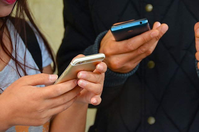
Put yourselves in the subscriber’s shoes for a moment and take the picture below as an example of a newsletter you’ve received.

Source: Reallygoodemails.com
Before you’ve even bothered reading the newsletter’s text, your attention immediately shifts to the bright landscape and the dominant blue theme. Then, you notice the ever-so-slight animation of the purple flowers, moving gently on either side of the pictures as you slowly move forward through it, and as you scroll down through the text, your eye’s path is carefully directed towards the bright, colorful call-to-action buttons.
If you followed through with our little thought exercise and understood where your attention is being directed, then you should understand by now just how important a newsletter’s design is, and more importantly – how different colors play different roles in a newsletter’s color scheme.
Choosing the perfect theme
Designers use different colors for different purposes when selecting a color scheme for a newsletter.
Selecting a color theme starts with choosing a base color (usually those will be your brand colors). Then a second color (and often, the third one too) is selected based on – unsurprisingly – the base color.
The psychological impact of colors
Each brand has its branding directives, which also cover color choices. This is so for two reasons:
1. To create a consistent brand guideline.
2. To invoke different emotions within the readers, such as a warm\cold feeling – to generate “visual stimulation”.
Our brain is hardwired to react a certain way to every different color. For example: Yellow is associated with sunlight, invoking warm, positive emotions, whereas red is the color of passion, and immediately causes one’s heart rate to increase. Blue is the color of the ocean, and it stimulates a feeling of calm and tranquility.
Different shades of color can invoke different feelings. For example, a striking red may be related to rage, anger, and blood, while pink – which is essentially a shade of red – typically stimulates feelings of love and romance.
Colors and cultures
This is EXTREMELY important when sending a newsletter to an international audience, as different colors bear different meanings in different cultures. Red is the color of festivities and good fortune in the Chinese culture. Meanwhile, in the Celtic culture, it is the color of death and the afterlife. Black is often associated with mourning and generally bad fortune in most western cultures, but according to Chinese Feng Shui, it is a color of financial prosperity, success, and power.
Seasonal newsletters
Each season has its own colors. Many newsletters take into consideration the current season, for example, using orange and yellow during summer time, and white and grey during the winter.
Spam filters and newsletter colors
Most email providers today use spam filters, and one of the things that these filters “hate” the most are overly-shiny and glittery emails.
What does “overly-shiny” means?
Very bold and striking colors like bright red and green, which we sometimes use to accent certain parts of a newsletter, often cause these spam filters to identify the newsletter as spam. That’s why there are guidelines and rules for creating newsletters, following those rules and guidelines will help your newsletter stay out of the spam folder.
So, to wrap up, color schemes in newsletters aren’t there just for aesthetic purposes, they are much more significant.
What you should know before you start:
1. The newsletter’s goal.
2. Preferred theme.
3. Information on demographics, such as gender and location, to avoid any misunderstandings.
4. Is this a seasonal or a holiday newsletter? Got all the answers? You can go ahead and start working on your email marketing campaign.
Good luck!