Creative Content & Design
About 215 billion emails are sent every day.
Around 90 billion of them are of consumer nature.
A person working in an office, receives 121 emails a day, on average.
How can we attract his attention?
Design

By athleta.com
It's almost impossible to stay indifferent to a gorgeous newsletter. But what can we make of it? Is there a special design "magic" that influence all readers? Or is beauty a matter of personal taste?
A matter of taste?
Let's take a classic situation: I enter my favorite clothing shop. Naturally, not every item is sweet for my taste. So how can a shop owner choose which items should they display in the showcase or in the newsletter, for that matter? How can they apt to most visitors / readers' taste? The answer is almost as simple as "It's not the 'what' it's the 'how'". To support that claim, let's have a look at the following example:
I chose to use this particular example among hundreds of newsletters, mostly because I loved the way the newsletter designer, put part of the scarfs on top of a picture and the bottom part isolated, in such a way that they almost look touchable. Now if I would have seen one of the scarfs solely in the store, I might not buy it. But the way they laid on the newsletter canvas - just leaves the right impression.
This is the note we'd want you to take from this example - sometimes it's the way things are laid, the composition, the "touch" of a skilled designer, that makes us fall in love with what we see in front of us, rather than the items themselves.
Trends
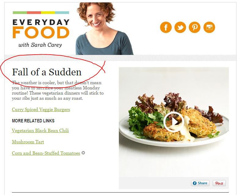
Same as other design fields, newsletters are also influenced from trends, styles and the gimmicks of the season. A new trend often makes us stop and look, it catches our attention. Caught of attention, is, of course, something publishers are constantly looking for.
Big brands keep an in-house trendologist, whose job is to be on the alert, follow worldwide trends and come up with new trends. Most of small-medium businesses, update and adopt some of the new design spirits, according to their brand identity and financial abilities. Our advice - be cautious in adopting trends. Take into account your brand identity that dictates a certain set of colors and other graphic rules, stick to your brand behavior in different media. These rules apply to email marketing as well. But, reasonably refreshing change, works well, even if it's all about a certain element which gives a bit of a new angle.
The "WOW" effect
Let's talk about the bottom line: mostly picture DOES worth thousand words but it depends on WHICH picture... Amateur design can leave the viewer indifferent or worse yet - with the impression
of disrespect. On the other hand, a professional designer, can make us feel, and leave an impression even on a very critical viewer.


Further reading: 100 beautiful emails
Creative
Let's start from the bottom line: yes, some people were born gifted with the talent to surprise, to combine words in such way that make us laugh or at least nod in agreement. Wit, ingenuity and creative thinking are some characteristics that can be developed to some level, but let's face it - some people just born that way.
How is it reflecting emails?
When it comes to creative we tend to think double meaning or playing with words.

It really works, having your way around with words. The good news is that you don't have to be constantly with or to make your readers laugh, most of the time it's mostly important to be warm, personal and welcoming. Let me translate for you the adorable welcoming words they're using to congratulate me on purchasing my ticket to the annual UX congress:

Today's internet-content-writing, is much more of a spoken language than before. And we embrace that tendency. Writing eye to eye, heart to heart, genuinely - that's what make us feel close to the writer. It takes a whole lot of creativity to create your own brand language. But not necessarily creative in the witty way, but more likely in the warm & genuine way or better yet - the unexpected yet so fit, a way that makes your readers feel something like "yep, exactly like that".
More than a punch line
Great creative leaves an impression on us not only using a brilliant slogan, text or strong images. Sometimes it's the way we catch the moment and do something with it. How abou thismoment:
Our dear customer, Indigo hotel TLV, catches moments like that regularly and makes us all daydream while working... Understanding that certain moments make us feel and react, is the key to reach your customers. You know your customers better than anyone else, so think - what are they daydreaming about? What are the special meeting-points between you and them, and how can you surprise them with a special offer in those moments? To be noticed and indulged in a special moment - makes a remarkable impression.
Content
After praising the strong impression of good design and creative, we want to share with you an observation: along the years, we came across many individuals and companies that sends text-only-newsletters, and have a loyal admiring audience. It's because they provide their readers fabulous content constantly. And no, we are not referring to marketing content, readers recognize this kind immediately and delete your mail or better yet - mark your content as spam. We are talking about real conversation, real value for your readers. Here's how-to:
First most important rule: "don’t do to another what is hated by you".
No one likes advertising or being persuaded to buy. The more so receiving email or text message with content we don't ever remember signing in to receive. Feeling of abuse is the most hateful thing one can leave in subscribers. Even if you convinced your product is a must have, a gift from above - sending irrelevant suggestions to people is the last way to gain conversions.
Second principle: You already won them.
Advertisers tend to think that with each newsletter or any other addressing to the end user, they need to re-convince them to purchase their products. They can't be more wrong. Let's line up with this one: if I already signed up to receive updates from you by email (i.e: Newsletter Subscription), it means that I already expressed my willingness to be in touch. You don't need to keep selling me how fortunate I am and what tremendous opportunities are in front of me etc. This is a very delicate perception-change: We don't advertise to our readers. We talk with them. You can even ask them what kind of content or offers they're expecting to receive from you. Matching expectations are extremely crucial for all kinds of communications. It applies also for newsletters - talk to your readers' eye to eye, listen to their feedback and improve. Be honest and generous and they will react positively.
Which leads us to
The third rule: Be valuable
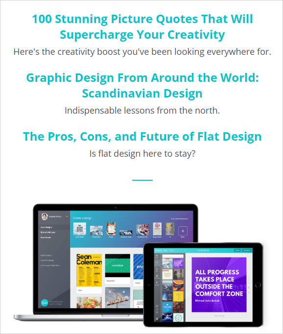
Create valuable content. Let's have a look at the following example:

Familiar with Canva? It's a free design web platform, enables you to create all sorts of design goodies. They have a design school, full with free articles and guides, all flavored with endless of example, they give a very high value to their readers, as much as you really go on and read their newsletters. They don't aggressively sale their main product which is the design platform, but rather generously spoil their readers.
Share your thoughts & goodies with your readers, spoil them, be generous and they'll look forward to your next mail. Keep in touch!
Need Help? Talk to us


